
Ever since I was a child, I have had a gift – A gift of predicting which color would be in trend in a year or two. I would chance upon the color and not let it go – I would hunt for the most beautiful objects in that color(s) amidst open criticism and fill my cupboards and house with it. It should have made me a great forecasting reporter, but it didn’t or rather I didn’t try and capitalise on it so I am here squabbling with people over my color choices and grinning devilishly and saying the proverbial “I told you so” at the back of my head when the color(s) become a huge trend.
As student I have faced innumerable “Which forecast predicted this color for this season?” questions and as a designer I have had shopkeepers tell me that nobody wants these colors or that they dont go well with one another. As an individual I have had Fashionistas snigger behind my back, my friends question my choices and my family facepalm for the lack of a better reaction.
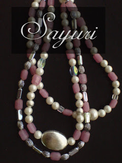 |
| Pearl & Pink glass bead necklaces from 2009 |
It has been happening this year too.
I have been a girl who dislikes pink – I find it too girly and boring much to my parents dismay and I think I have had maybe two mauve clothes my entire school life. But then I have been drawn to light pink and lavender for the last few months- I am always on the lookout of rose quartz, I am using pink/purple nailpolish everywhere and hearting pink clothes by the dozen. I have also spent the better part of this year hunting up jewelry supplies and clothes in Lavander apart from dull pink without much success. The last time I used light pink and lavender was way back in 2009 when I was just starting to make jewelry and dint want to alienate any color. I have always used hot pinks in my designs for vibrancy and energy but now I find dull gray pinks calming too. So naturally people around me, who know me, are curious and ask “Whats wrong, did something happen?” when they see me make these choices. so before people find one more reason to label me crazy, Pantone has come to my rescue and announced the Colors of the Year 2016 as Rose quartz and Serenity. I did a little pirouette and pumped my fist in the air. Yes, I wasn’t as crazy as people thought!
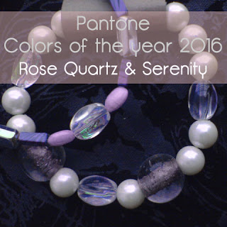
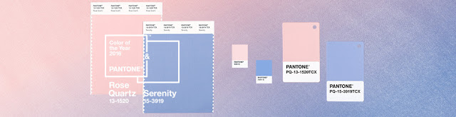
Pantone Color of the year 2016
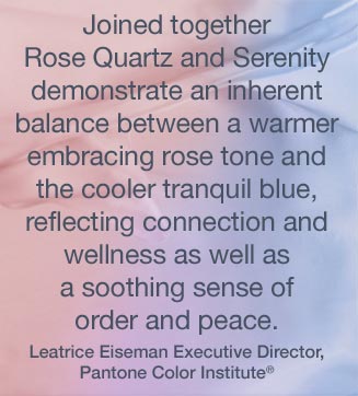
For the first time, Pantone has announced two colors – Serenity (a lavenderish blue) and Rose quartz (pink) -a harmonious pairing of complementary shades to offer a soothing balance in this world that is ripe with war, strike and suffering.Here is a video from Pantone, introducing the colors.
Pantone Color of the year 2016 announcement has gathered mixed reviews. On one hand, most people find these colors soothing – makeup mavericks are rejoicing, Jewelry designers are stocking up on rose quartz before it becomes too expensive and formal wear designers are jumping in joy for their palette is sorted.
On the other hand many feel that these colors are dull, extremely dull for festive and winter collections which generally bring in more revenue than the summer collections. Apparel designers who work in the party wear segment seem to be bummed out too. Then there is this issue of skin tones; neither rose nor serenity look good on people with yellow-white and yellow-brown skin tones – precisely the reason I havent been able to find clothes in these colors that suit me. Hopefully designers around will come up with more creative solutions soon.
what about you, my readers; do you like these colors? How will you use them in your jewelry?
To know more about rose quartz as a gemstone, how it can be used in jewelry, do tune in later this week for a post on Rose quartz. Those who turn up will get an opportunity to win some luscious rose quartz beads along with other gemstones beads.
I hope you found it interesting
Cheers
Leave a Reply