
In March, I began a series on colour harmony to talk about how I use colour. The first post on the series Monochromatic Pulli Kolam necklaces was about understanding the monochromatic colour harmony. In this post on Analogous Pulli Kolam necklaces, we will look at Analogous colour harmony. The term “Colour harmony” denotes sets of colours that can be used with each other to bring about the feeling of harmony in a design. Harmony, along with unity, Rhythm, emphasis and balance form the five principles of Design.

Colour Wheel and Colour harmonies
Analogous palette consists of adjacent colours on the colour wheel. To those who are new to a colour wheel (see below), it is a circle with 12 segments. Each segment is filled with a single hue (and extended to its tint and shades – lights and darks). Red, yellow, and blue which are at a triangular placement from each other are primary colours. If you mix two primary colours, you will get secondary colours like orange, green, and violet. You will see in the center of the space between the primary colours. Colours in between the primary and secondary are known as tertiary colours. Yellow, orange, and red are warm colours and green and blues are cool colours. Regardless of how the wheel rotates, the position of the colours in relation to each other will not change.

Analogous Colour Harmony
Three to five neighbouring colours on a colour wheel form an Analogous Colour Harmony. While you can use upto 5 colours in your design, I usually restrict my palette to three colours only. This is to make sure that my palette is either cool or warm. If you mix both together, you might get into balancing trouble. Red, red-orange and orange or yellow, yellow-green and green and are my preferred analogous palettes. Apart from the central hues, tints, tones and shades of a hue can also be used in the palettes. People prefer an analogous palette as it is harmonious and found in nature. Plants like Croton, sunrise/sunset, grasslands, certain birds follow this palette. However, like monochromatic, this palette can become boring very easily. The key is to use great accents and textures while working with it.
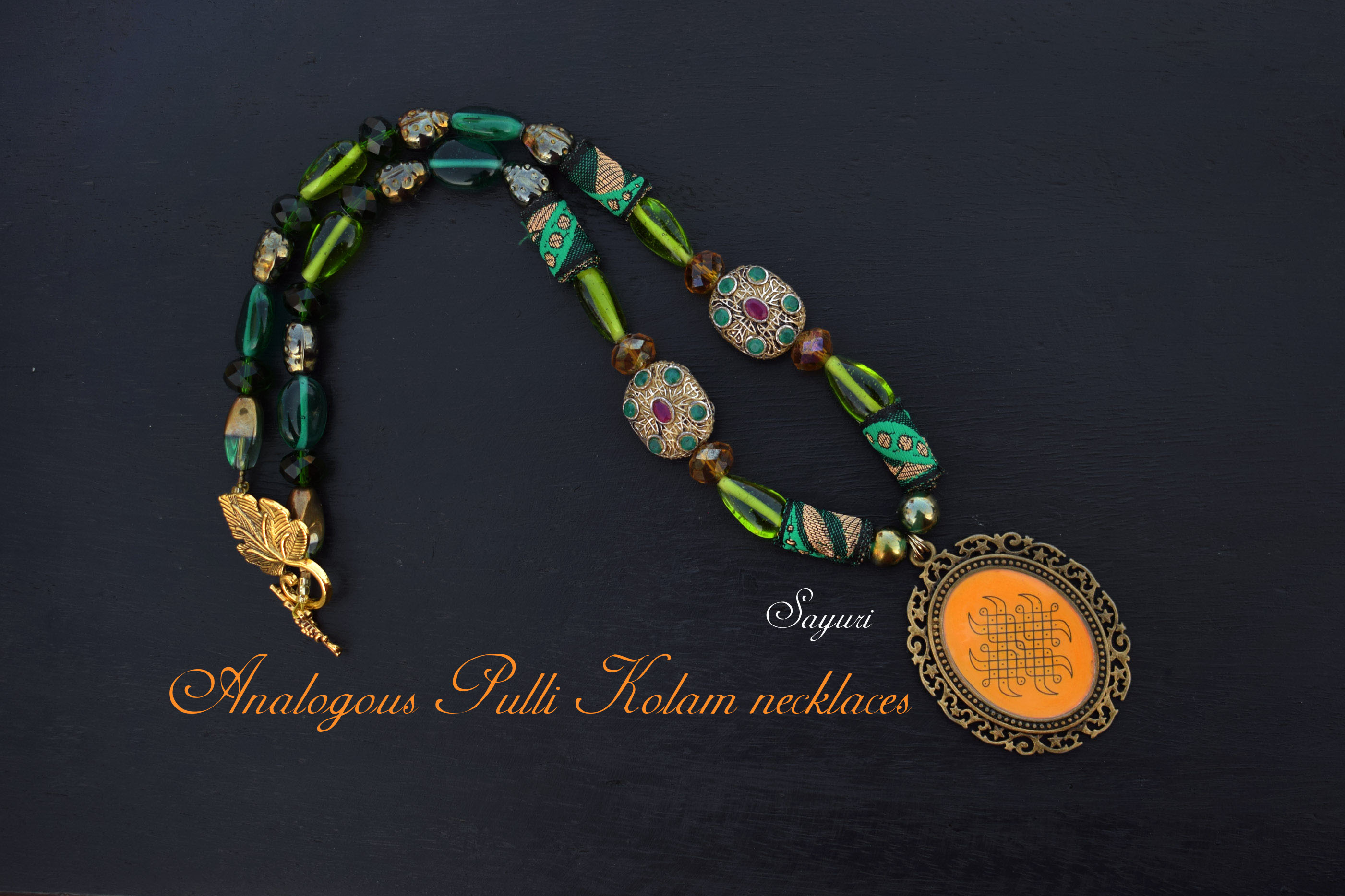
Analogous Pulli Kolam necklaces
Here are some of my necklaces from the Kolam III collection that follow the Analogous Colour Harmony scheme.

Green & Yellow kolam necklace
This is a striking bead necklace in green, yellow green, and yellow. Apart from pure hues, it has several shades (of particularly green) in it. The pendant is antique brass with an eternal knot (sikku pulli kolam). This necklace is for sale along with the complimentary earrings shown in the picture.

Rani Victoria necklace
Next up is a royal necklace with Victorian gilded beads and an ornate oval frame. This glass bead necklace in yellows and greens is quite long. It has a strong sense of movement even in a symmetrical pattern. While, I have skipped the yellow colour in the palette and gone straight to yellow-orange, it is still fall under analogous as a variation. This necklace is sold.

Colours of Autumn necklace
Red, red-orange, and orange are traditional (western) colours associated with autumn. Unlike the necklace that you see below, this one does not rely on pure hues. There are four different oranges in the necklace – orange, tangerine tango, flesh tint, and fluorescent. Still, it cannot be considered monochromatic due to the presence of yellow-orange spaces, red-orange in the clasp, and red crystals. Silver and purple are accents. This necklace is for sale along with the complimentary earrings.

Last but on the least, is the Kavi Kolam necklace that I spoke about in my first Kolam III post here. I am showing it again, in the context of pure analogous hues. It has beads in orange and red and a pendant in red-orange. This necklace is sold.
For those who are starting to play with colours in jewellery or any other product for that matter, I recommend trying analogous colour harmony. This harmony will ease you into using multiple colours that still give you balance, rhythm and unity – three of the five principles of design without trying too hard. If hope that you like my Analogous Pulli Kolam necklaces. Do share in the comments your favourite analogous palettes and their variations. Look forward to the next post in this series on Complimentary colours.

I hope you found it interesting
Cheers

4 responses to “Analogous Pulli Kolam necklaces”
This is one of the most comprehensive explanations of color theory I’ve come across. I will have to check the color wheel more often as I sometimes struggle with color combos when I happen to use more colors. I can see what you mean by harmony when I look at your necklaces, Rani Victoria being my favorite.
Thank you so much Rozantia. A few years back I wanted to do a series of posts on colour theory. But that didnt happen. So I thought I could atleast share a bit about colour harmony. Please do share it with anyone who you think will find this post useful
I do like how you use color. These necklaces are beautiful.
Thank you Ann. Do check out the third post in this series as well.