

In continuation to my series on Colour harmony, here is a post on Complementary colour jewellery. After using Kolam III jewellery as examples in the first 2 posts, it would be a shame not to continue using them. So here are a few pieces of Kolam III jewellery in Complementary colour harmony. You can find the first post on the series Monochromatic Pulli Kolam necklaces here and the post on Analogous Pulli Kolam necklaces here.

Colour theory and Colour harmonies
Let me go back to basics once again. Colour theory refers to the study of colours and how they interact wit hone another. It also, includes the physical, mental and emotional influence a colour has on humankind. This is known as colour psychology. I discussed the Colour wheel, in my past post and we will use it to understand complimentary colours as well. If you are new to colour theory, I recommend that you read the post on Analogous Pulli Kolam necklaces first, by clicking the link in the first para of this post. By understanding and using Colour harmony well, you can easily bring about a sense of unity and harmony in your design which are two of the five principles of Design.

Complementary colour Harmony
A standard colour wheel is a circle of 12 segments of hue (pure colour). Colours such as Yellow, orange, and red are warm colours and green,blue and violet are known as cool colours. The word “complement” refers to something that supports or enhances another. Thus, a Complementary colour Harmony is always a pair of colours, the enhance one another. They are colours that are directly opposite one another on the color wheel. There are often direct contrasts like red and green, yellow and violet and blue and orange. As always, tints, tones and shades with their corresponding versions of complementary colours are fair game. As a result, a Complementary colour Harmony is one of high contrast and can be used to attract a lot of attention.
Complementary colour jewellery
Here are some of my necklaces from the Kolam III collection that follow the complementary Colour Harmony scheme.

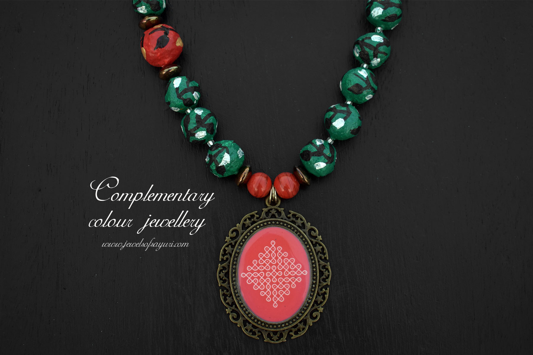
The Classic Red and Green
In the western context, whilst Red and green is a festive colour combination, it is associated with Christmas decorations. Hence, it not a combination that you see people wearing on a regular basis. But in India, due to the same cultural construct of the combination being considered festive it is commonly worn both as clothing and jewellery. Infact, red and green precious jewellery is so common, many do not buy costume jewellery in this combination. But I do make it from time to time for I like its strong contrast.
This necklace is particularly special, due to the paper machie beads. The graphic nature of these handmade beads by Wellpaper Auroville is what inspired this necklace. Since this is a high contrast combination, we need neutrals for balance. The black and white, along with antique brass provide the same. This necklace + earrings set is for sale.

Complementary Colour to Pink
Pink is one of the most commonly used colours in jewellery. A (light) pink is a tint of red and so its complementary will be light green. Together they give a fruity, fun, spring vibe. But I tend to use brighter and deeper pinks in my work. Therefore, even when a mid to dark green is not a direct complementary, I use this combination often. It is very common and safe colour combination in Indian wear (sarees and Kurtas). Therefore, it makes sense for me to extend it to jewellery as well. Pictured above is a pink and green rangoli necklace that has been reserved.

Yellow + Violet = High contrast
When I made Parampare and Kolam II, I got many requests for high contrast pieces, particularly in yellow and violet. The yellow and violet you see on the colour wheel are very strong colours. So in order to soften the look, I have used purple, mustard yellow and gold along with the principles hues. It is not for the weak hearted but might go extremely well with a yellow saree which has a blue or a purple border. This necklace + earrings is available for sale.
Tips to use Complementary colour Harmony in jewellery
- To make a complementary color harmony work choose a warm and cool colour that is suitable for the theme or vibe that you are going for.
- Starting with a base color and then add its complement.
- Use metallic colour accents
- Avoid using a third colour as much as possible. If you must use accents restrict yourself to using variations of the base colours only.
I hope that you like my Kolam based Complementary colour jewellery. Please feel free to ask any colour related questions and I will try my best to answer them. Do share in the comments your views on using complementary colours in your work. Also, share your tips for working with high contrast colours. Look forward to the next post in this series on Split Complimentary colours.
I hope you found it interesting
Cheers

6 responses to “Complementary colour jewellery”
I see now that I should always have a color wheel on my working table 🙂 Sometimes, I pick several colors before I find the best match. Very well explained and useful for someone like me, Divya!
Thank you. You could simply draw one on your tablet as you have been learning to sketch. That way you’ll have it memorised and handy.
What a great idea! It also has all color variations and an option to draw geometrical shapes 🙂
I am glad that I could help
Great tutorial for those of us not trained in color theory, Divya! Thanks for being so accessible and providing such beautiful examples.
It is my pleasure Lynda. I am planning an entire series on Colour. I hope it attains fruition. Do catch up on the previous posts as well.