
In my last post on Kolam jewellery, I introduced to you the Kolam 2.0 collection. The collection was not really planned or previously thought of. I made the pieces simply with whatever struck my fancy at the moment. The colours, textures, materials and forms were are spontaneous. But when working on that range, something interesting happened that made these spontaneous decisions seem predetermined. They all turned out in tune with Pantone forecast namely the 2018 Autumn-Winter and the 2019 Spring forecast.
Pulli kolam and Pantone forecast
To be clear, I did not look at any forecast before I began the range or while working on it. So it could have been a coincidence. But then this has happened with me far too many times in the past for me to believe in coincidence. Pantone or any forecast agency for that matter, constantly surveys the past and present to forecast the future. They study, learn about the dominating events, ideologies, people in their process. So if you are constantly paying attention to the “Zeitgeist” or the spirit of the times, and you are trained to identify them, as is my case, you are more or less about to come to the same conclusions as the forecast agency.
Coming back to Kolam 2.0, I feel that this is what has happened. In this post, I want to show you some pieces from the range and how they match with Pantone’s forecast palette. I first came across the Pantone forecast colour palette images in the Article on Firemountain gems after I made my pieces. So here is a reverse forecast post. These kolams are drawn based on patterns shown in Kamalascorner. Do look up the site for more inspiration.
London Fashion Week Autumn/Winter 2018 Pantone Forecast
The first forecast I want to discuss is the Autumn/Winter 2018 Pantone Colour Forecast . It is based on London Fashion week. Here I am looking at two palettes in particular – The Rich tropical and the Saturated Autumnal palettes.
Saturated Autumnal palette
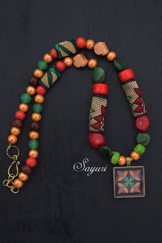
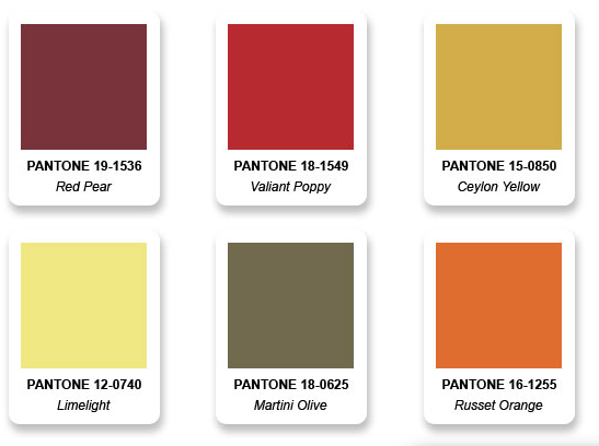
The Saturated Autumnal palette that you see above is a mix of earthy colours with brighter pops of russet and poppy. It follows the analogous colour harmony. In my necklace you can see the use of red pear, valiant poppy, Martini olive, and Russet orange from the forecast. In addition to this I have also used shades of green to make it a sort of split complimentary piece. This makes the necklace more suitable to the festive rangoli pendant
Rich Tropical Palette
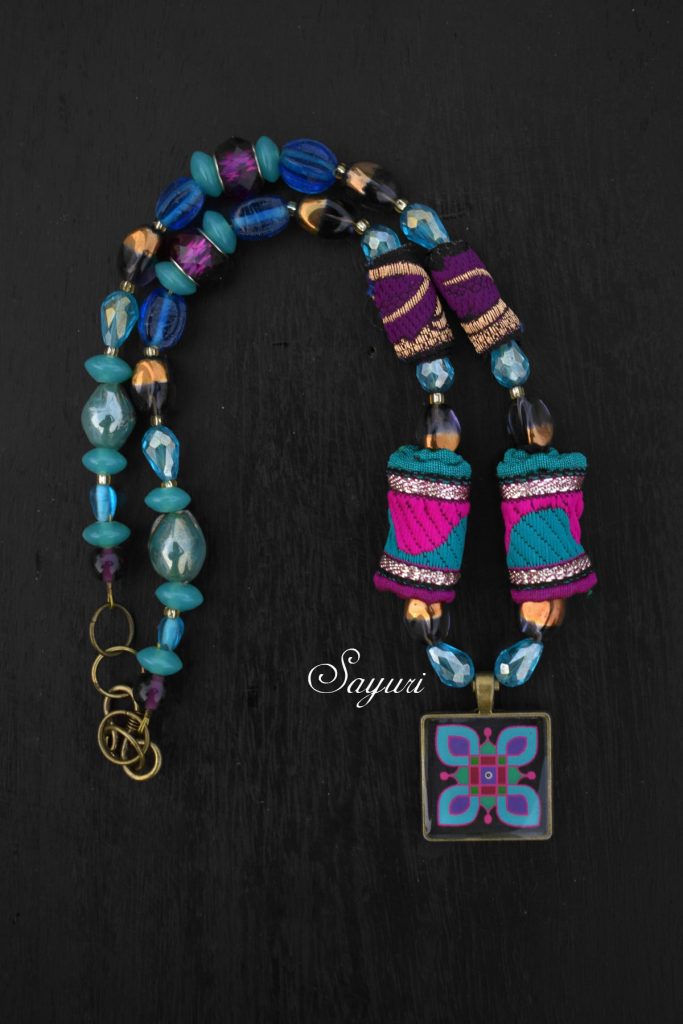
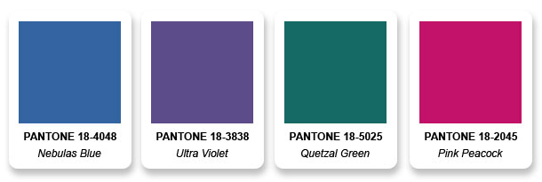
The Rich Tropical was kind of surprising as these are not really tropical colours. Nor have I ever seen them being used together in fashion (apparel) collection unless its very designer/brand. So you can imagine my delight when I saw my necklace having all four colours of this palette. It had Nebulas blue, Ultra violet, Quetzal green and Pink peacock. The colours might look at bit different in the necklace photograph due to bad lighting but trust me they are the same.
London Fashion Week Spring/Summer 2019
The second forecast I want to discuss is the Spring- Summer 2019 Pantone Colour Forecast . It is based on the London Spring Fashion week as well. Here I am looking at two palettes as well. The pantone website still hasn’t named them. I wonder why?
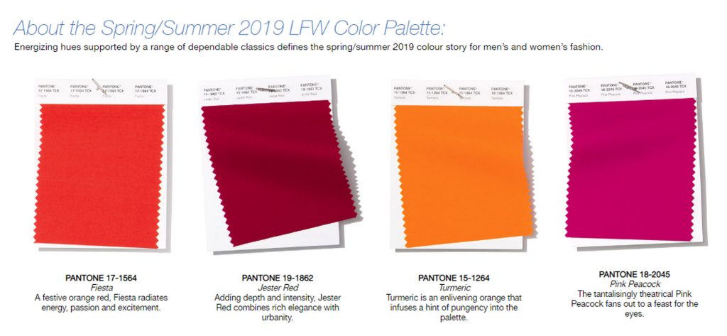
Pink & Orange
Though I work with a lot of bright colours, I cannot wrap my head around Orange. This necklace was a double whammy. In a moment of pure insanity, I thought of combining a bright pink with a bright orange. It took a few attempts to get it right but I really loved the outcome. I have never been more pleased with orange.
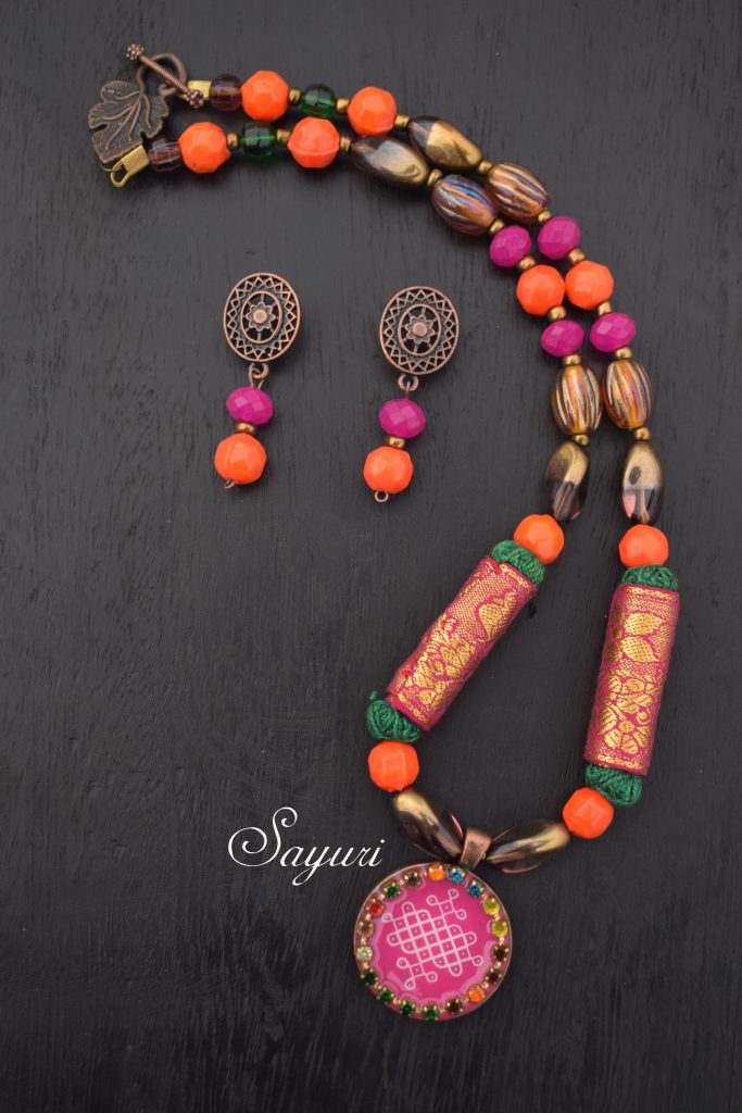
I used a combination of zari fabric and thread beads for this necklace. Instead of just using chunky beads which is my usual style, I have used seed beads as spacers in most of these necklaces to get leaner, lighter pieces.
Of blooming yellows and greens
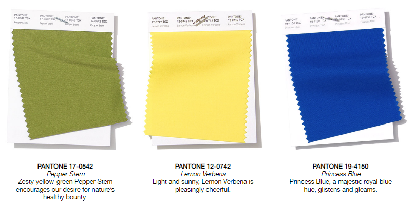
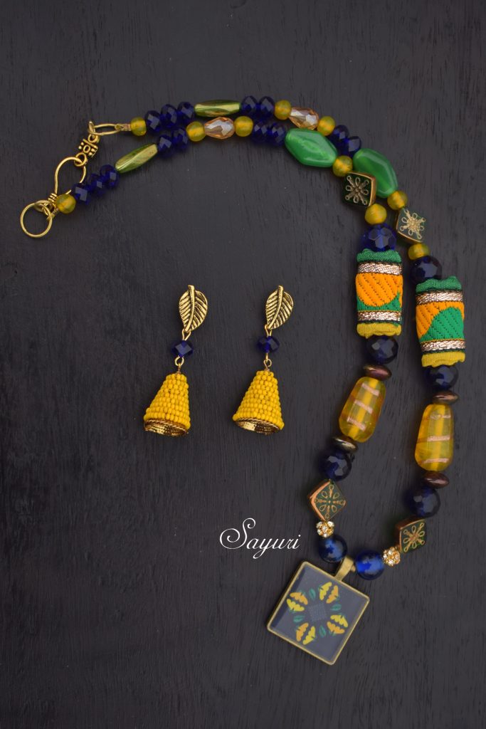
Yellow and green for spring is a no brainer. Plus yellow, blue and green sort of flow into each other the way analogous colours do. Along with Pepper stem, Lemon Verbena and Princess blue this palette has another green and a deeper yellow as well. However, in this last piece (of this post) the palette did not exactly match my piece. I too made a piece in green, yellow, and blue but my colours were two hues and a shade (blue) of the Pantone palette. Nevertheless, it still matches a forecast – the WGSN SS19 Colour forecast.
Comparison with WGSN SS19 Colour forecast
WGSN is a Trend forecasting agency that is followed by most designers across the world. While They concentrated on Europe (UK primarily) and USA in the beginning, they have a strong African and Asia focus as well now. In the process of making my teaching notes, this morning I looked at their SS19 and look what I found – My yellow, green and blue.
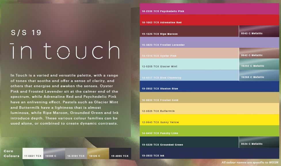
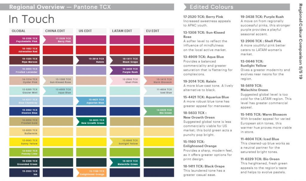
In the above image you can see the colour palette one of their global forecast stories called “In touch.” In the below image, you can also see the subtle changes they have made to tweak the forecast for different regions. WGSN like every other forecasting agencies, derives its colours from Pantone. But unlike Pantone that does macro and micro research on factors that influence colour, WGSN does more micro level research in areas other like material, pattern, silhouette, and detailling as well.
Summing up, in the case of Autumn 2018 palettes I was right on the mark with Pantone’s forecast. But, in the case of spring palettes, My work matched with WGSN forecast but was away from Pantone’s mother forecast. It was interesting to analyse the forecast after the fact and study the impact of collective influence on a designer and her work – even if its just my own. Have you been using any of these colour palettes in your work lately? If so, I would love to hear about your interpretations.
If you like to know how to read, interpret or decode forecasts, do write to me, I can set up a class/learning module for you. If you would like me to do a post, please say so in the comments as well.

Leave a Reply