
Agreed that 2020 has been a crazy year full of shocks and surprises. Pantone wanting to ride on the coattails of everything else going on in the world were building up a lot of suspense with regard to their COTY. Finally, they launched their Colour of the year 2021 today which turned out to be a Bazinga. Pantone COTY 2021 is Illuminating and Ultimate gray. The two unrelated colours and hence the bazinga. Check out last year’s Colour of the year post if you want to understand why it matters.
I just attended a detailed seminar by Leatrice Eiseman discussing the same and here are the highlights.
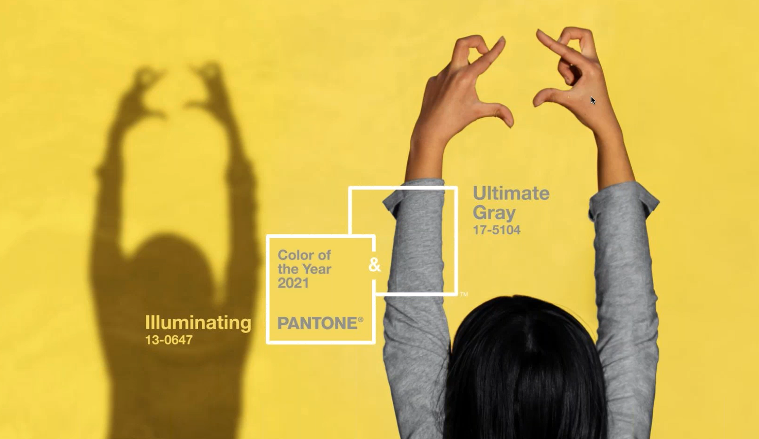
Pantone COTY 2021 – Illuminating and Ultimate Gray
The Pantone colours of the year 2021 are PANTONE 17-5104 Ultimate Gray and PANTONE 13-0647 Illuminating. According to Pantone, this signifies a start of a new day. The combination indicates light at the end of darkness that gets us through difficult times. The gray symbolises resilience, rootedness, stability, clarity and comfort. Yellow denotes cheerfulness and hope and together they offer greater meaning.
The contrast of bright with neutral indicates expresses individuality. These are two different elements that can stand alone but are stronger in union. Quite philosophically, Ms. Eisemen spoke of a “Marriage”, a support system where people come together help and support each other. Answering my question on whether this is a “safe choice”, she explained that this choice is based more on the symbolism rather than practical reasons.

My reflections on the selection of colours in 2021
I attended two other Pantone seminars for 2021 colours recently. Both hinted at the importance of Yellow colour. Moreover, yellow has been trending across trend reports including that of WGSN, Azkonobel and is also trending in social media for it “reflection of Happiness.” I was expecting a yellow as COTY. Pantone, WGSN and Promostly are also very partial to neutrals which I discussed in class with my students. Gray was one of the suggestions given by a lot of students, while I favoured brown. But since we did not anticipate another two colour year, we decided that it would be yellow or brown. I painted a door in my room a yellow a few months back. Dulux did pick a brown (Brave ground) as their COTY for interiors.
Furthermore, a few days ago, Pantone put out a teaser on social media suggesting Black or dark gray to be the COTY. Many rose up with fury saying that these are classics, neutrals and are too “depressing” to the colour of the year. Another group fought back saying that it was a desaturated teaser image and the actual colour will be bright and cheery. Looks like both groups were right.
WGSN’s Coloro (a partnership with China Textile Information center) have been hailing a blue-green – AI Aqua as the COTY 2021 for two years now. Benjamin Moore (a paints company) following this forecast has announced Aegean teal (a desaturated version of AI Aqua) as their colour. It is interesting how Pantone has struck down Coloro’s immerging dominance in one move by providing a colour combination that will work for most design fields.
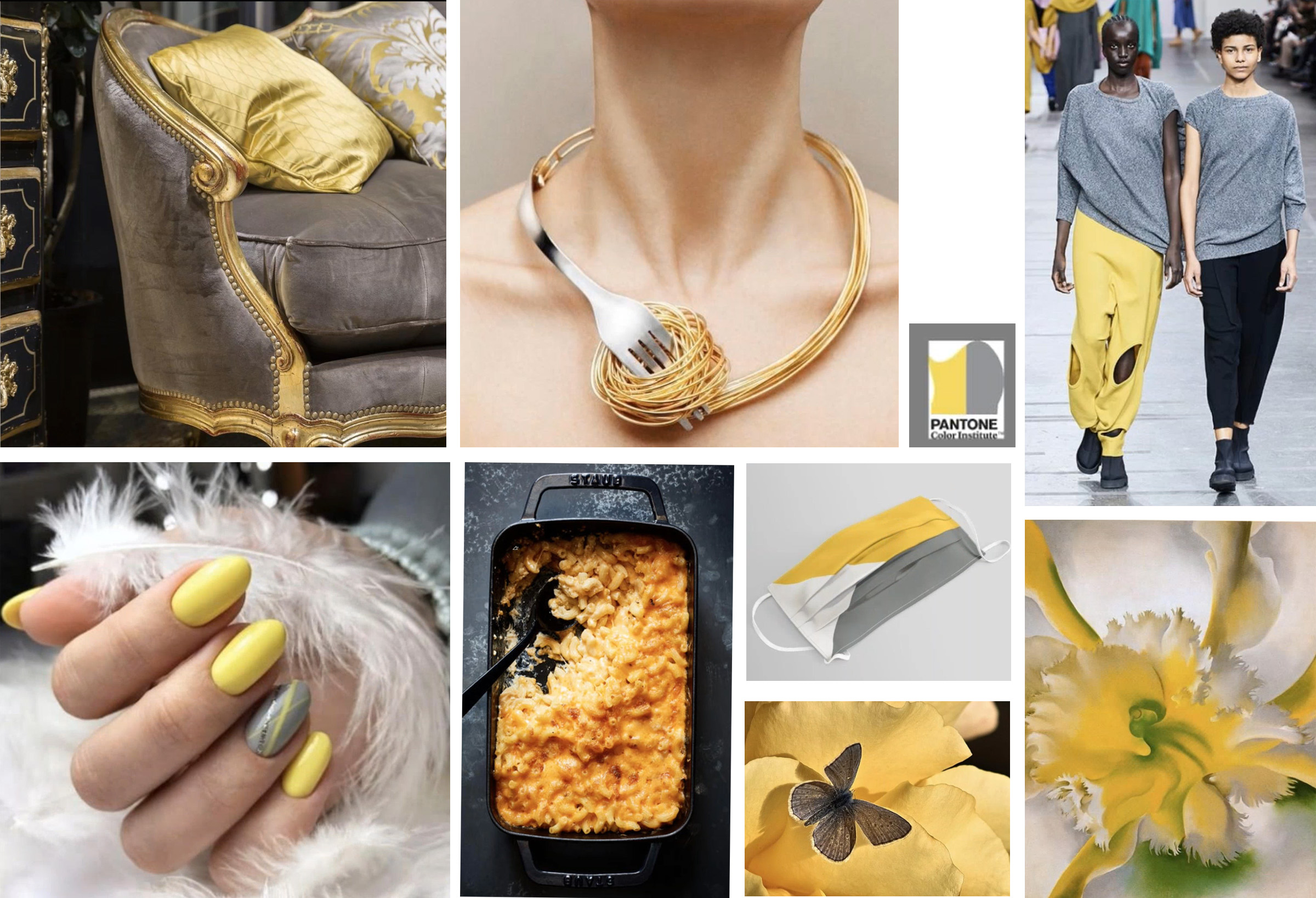
Applications of Pantone COTY 2021
The last time that Pantone had two colours of the year was when they had Serenity and Rose quartz in 2016. The blue and pink shared a tonality and were analogous in nature. However, Gray and yellow are different as chalk and cheese, to an extent literally. They are opposites – Neutral + Bright. However, that is exactly what may make this a popular choice for people to follow. Following this colour trend will be as easy as wearing an yellow Tshirt or kurta with gray bottoms or a knitted gray tank top with an yellow skirt. In jewellery, I can instantly think of a mix of gold and silver. You can useyYellow topaz or citrine with Silver in the Precious category and yellow fibre or glass beads with silver tone wire in costume. I will discuss more about this in a post in January 2021.
What do you think of this year’s choices? How will you use them? Tell me in the comments.
I hope you found it interesting
Cheers

Leave a Reply